三、CSS基础
1 盒模型
content(元素内容) + padding(内边距) + border(边框) + margin(外边距)
延伸:box-sizing
content-box:默认值,总宽度 =margin+border+padding+widthborder-box:盒子宽度包含padding和border,总宽度 = margin + widthinherit:从父元素继承box-sizing属性
2 BFC
块级格式化上下文,是一个独立的渲染区域,让处于
BFC内部的元素与外部的元素相互隔离,使内外元素的定位不会相互影响。
IE下为
Layout,可通过zoom:1触发
触发条件:
- 根元素
position: absolute/fixeddisplay: inline-block / tablefloat元素ovevflow !== visible
规则:
- 属于同一个
BFC的两个相邻Box垂直排列 - 属于同一个
BFC的两个相邻Box的margin会发生重叠 BFC中子元素的margin box的左边, 与包含块 (BFC)border box的左边相接触 (子元素absolute除外)BFC的区域不会与float的元素区域重叠- 计算
BFC的高度时,浮动子元素也参与计算 - 文字层不会被浮动层覆盖,环绕于周围
应用:
- 阻止
margin重叠 - 可以包含浮动元素 —— 清除内部浮动(清除浮动的原理是两个
div都位于同一个BFC区域之中) - 自适应两栏布局
- 可以阻止元素被浮动元素覆盖
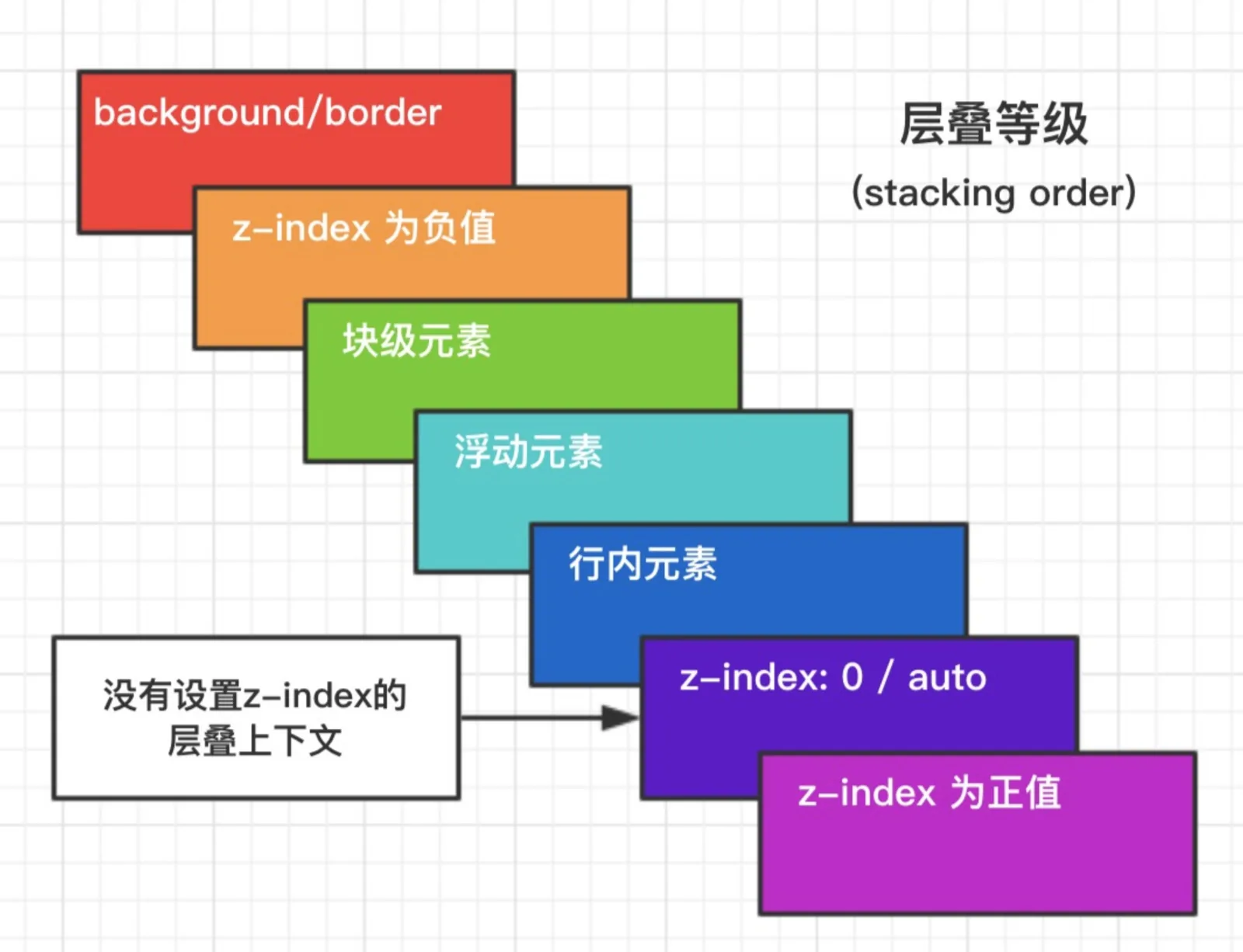
3 层叠上下文
元素提升为一个比较特殊的图层,在三维空间中 (z轴) 高出普通元素一等。
触发条件
- 根层叠上下文(
html) positioncss3属性flextransformopacityfilterwill-changewebkit-overflow-scrolling
层叠等级:层叠上下文在z轴上的排序
- 在同一层叠上下文中,层叠等级才有意义
z-index的优先级最高
4 左右居中方案
- 行内元素:
text-align: center - 定宽块状元素: 左右
margin值为auto - 不定宽块状元素:
table布局,position + transform
    /* 方案1 */
    .wrap {
      text-align: center
    }
    .center {
      display: inline;
      /* or */
      /* display: inline-block; */
    }
    /* 方案2 */
    .center {
      width: 100px;
      margin: 0 auto;
    }
    /* 方案2 */
    .wrap {
      position: relative;
    }
    .center {
      position: absulote;
      left: 50%;
      transform: translateX(-50%);
    }
5 上下垂直居中方案
- 定高:
margin,position + margin(负值) - 不定高:
position+transform,flex,IFC + vertical-align:middle
    /* 定高方案1 */
    .center {
      height: 100px;
      margin: 50px 0;
    }
    /* 定高方案2 */
    .center {
      height: 100px;
      position: absolute;
      top: 50%;
      margin-top: -25px;
    }
    /* 不定高方案1 */
    .center {
      position: absolute;
      top: 50%;
      transform: translateY(-50%);
    }
    /* 不定高方案2 */
    .wrap {
      display: flex;
      align-items: center;
    }
    .center {
      width: 100%;
    }
    /* 不定高方案3 */
    /* 设置 inline-block 则会在外层产生 IFC,高度设为 100% 撑开 wrap 的高度 */
    .wrap::before {
      content: '';
      height: 100%;
      display: inline-block;
      vertical-align: middle;
    }
    .wrap {
      text-align: center;
    }
    .center {
      display: inline-block;
      vertical-align: middle;
    }
6 选择器权重计算方式
!important > 内联样式 = 外联样式 > ID选择器 > 类选择器 = 伪类选择器 = 属性选择器 > 元素选择器 = 伪元素选择器 > 通配选择器 = 后代选择器 = 兄弟选择器
- 属性后面加
!import会覆盖页面内任何位置定义的元素样式 - 作为
style属性写在元素内的样式 id选择器- 类选择器
- 标签选择器
- 通配符选择器(
*) - 浏览器自定义或继承
同一级别:后写的会覆盖先写的
css选择器的解析原则:选择器定位DOM元素是从右往左的方向,这样可以尽早的过滤掉一些不必要的样式规则和元素
7 清除浮动
- 在浮动元素后面添加
clear:both的空div元素
    <div class="container">
        <div class="left"></div>
        <div class="right"></div>
        <div style="clear:both"></div>
    </div>
- 给父元素添加
overflow:hidden或者auto样式,触发BFC
    <div class="container">
        <div class="left"></div>
        <div class="right"></div>
    </div>
    .container{
        width: 300px;
        background-color: #aaa;
        overflow:hidden;
        zoom:1;   /*IE6*/
    }
- 使用伪元素,也是在元素末尾添加一个点并带有
clear: both属性的元素实现的。
    <div class="container clearfix">
        <div class="left"></div>
        <div class="right"></div>
    </div>
    .clearfix{
        zoom: 1; /*IE6*/
    }
    .clearfix:after{
        content: ".";
        height: 0;
        clear: both;
        display: block;
        visibility: hidden;
    }
推荐使用第三种方法,不会在页面新增div,文档结构更加清晰
8 左边定宽,右边自适应方案
float + margin,float + calc
    /* 方案1 */
    .left {
      width: 120px;
      float: left;
    }
    .right {
      margin-left: 120px;
    }
    /* 方案2 */
    .left {
      width: 120px;
      float: left;
    }
    .right {
      width: calc(100% - 120px);
      float: left;
    }
9 左右两边定宽,中间自适应
float,
float + calc, 圣杯布局(设置BFC,margin负值法),flex
    .wrap {
      width: 100%;
      height: 200px;
    }
    .wrap > div {
      height: 100%;
    }
    /* 方案1 */
    .left {
      width: 120px;
      float: left;
    }
    .right {
      float: right;
      width: 120px;
    }
    .center {
      margin: 0 120px;
    }
    /* 方案2 */
    .left {
      width: 120px;
      float: left;
    }
    .right {
      float: right;
      width: 120px;
    }
    .center {
      width: calc(100% - 240px);
      margin-left: 120px;
    }
    /* 方案3 */
    .wrap {
      display: flex;
    }
    .left {
      width: 120px;
    }
    .right {
      width: 120px;
    }
    .center {
      flex: 1;
    }
10 CSS动画和过渡
animation / keyframes
animation-name: 动画名称,对应@keyframesanimation-duration: 间隔animation-timing-function: 曲线animation-delay: 延迟animation-iteration-count: 次数infinite: 循环动画
animation-direction: 方向alternate: 反向播放
animation-fill-mode: 静止模式forwards: 停止时,保留最后一帧backwards: 停止时,回到第一帧both: 同时运用forwards / backwards
- 常用钩子:
animationend
动画属性: 尽量使用动画属性进行动画,能拥有较好的性能表现
translatescalerotateskewopacitycolor
transform
- 位移属性
translate( x , y ) - 旋转属性
rotate() - 缩放属性
scale() - 倾斜属性
skew()
transition
transition-property(过渡的属性的名称)。transition-duration(定义过渡效果花费的时间,默认是0)。transition-timing-function:linear(匀速) ease(慢速开始,然后变快,然后慢速结束)(规定过渡效果的时间曲线,最常用的是这两个)。transition-delay(规定过渡效果何时开始。默认是 0)
般情况下,我们都是写一起的,比如:
transition: width 2s ease 1s
关键帧动画animation
一个关键帧动画,最少包含两部分,animation 属性及属性值(动画的名称和运行方式运行时间等)。@keyframes(规定动画的具体实现过程)
animation 属性可以拆分为
animation-name规定@keyframes 动画的名称。animation-duration规定动画完成一个周期所花费的秒或毫秒。默认是0。animation-timing-function规定动画的速度曲线。默认是 “ease”,常用的还有linear,同transtion。animation-delay规定动画何时开始。默认是 0。animation-iteration-count规定动画被播放的次数。默认是 1,但我们一般用infinite,一直播放
而
@keyframes的使用方法,可以是from->to(等同于0%和100%),也可以是从0%->100%之间任意个的分层设置。我们通过下面一个稍微复杂点的demo来看一下,基本上用到了上面说到的大部分知识
    eg:
       @keyframes mymove
      {
          from {top:0px;}
          to {top:200px;}
      }

    /* 等同于: */

    @keyframes mymove
    {
     0%   {top:0px;}
     25%  {top:200px;}
     50%  {top:100px;}
     75%  {top:200px;}
     100% {top:0px;}
    }
用css3动画使一个图片旋转
    #loader {

        display: block;

        position: relative;

        -webkit-animation: spin 2s linear infinite;

        animation: spin 2s linear infinite;

    }

    @-webkit-keyframes spin {

        0%   {

            -webkit-transform: rotate(0deg);

            -ms-transform: rotate(0deg);

            transform: rotate(0deg);

        }

        100% {

            -webkit-transform: rotate(360deg);

            -ms-transform: rotate(360deg);

            transform: rotate(360deg);

        }

    }

    @keyframes spin {

        0%   {

            -webkit-transform: rotate(0deg);

            -ms-transform: rotate(0deg);

            transform: rotate(0deg);

        }

        100% {

            -webkit-transform: rotate(360deg);

            -ms-transform: rotate(360deg);

            transform: rotate(360deg);

        }

    }
11 CSS3的新特性
transition:过渡transform: 旋转、缩放、移动或倾斜animation: 动画gradient: 渐变box-shadow: 阴影border-radius: 圆角word-break:normal|break-all|keep-all; 文字换行(默认规则|单词也可以换行|只在半角空格或连字符换行)text-overflow: 文字超出部分处理text-shadow: 水平阴影,垂直阴影,模糊的距离,以及阴影的颜色。box-sizing:content-box|border-box盒模型- 媒体查询
@media screen and (max-width: 960px) {}还有打印print
12 列举几个css中可继承和不可继承的元素
- 不可继承的:
display、margin、border、padding、background、height、min-height、max-height、width、min-width、max-width、overflow、position、left、right、top、bottom、z-index、float、clear、table-layout、vertical-align - 所有元素可继承:
visibility和cursor。 - 内联元素可继承:
letter-spacing、word-spacing、white-space、line-height、color、font、font-family、font-size、font-style、font-variant、font-weight、text-decoration、text-transform、direction。 - 终端块状元素可继承:
text-indent和text-align。 - 列表元素可继承:
list-style、list-style-type、list-style-position、list-style-image`。
transition和animation的区别
Animation和transition大部分属性是相同的,他们都是随时间改变元素的属性值,他们的主要区别是transition需要触发一个事件才能改变属性,而animation不需要触发任何事件的情况下才会随时间改变属性值,并且transition为2帧,从from .... to,而animation可以一帧一帧的